← Back to work
AI · Product Design · Enterprise · 2024

Nexus — Dashboard Health Platform

Nexus hero

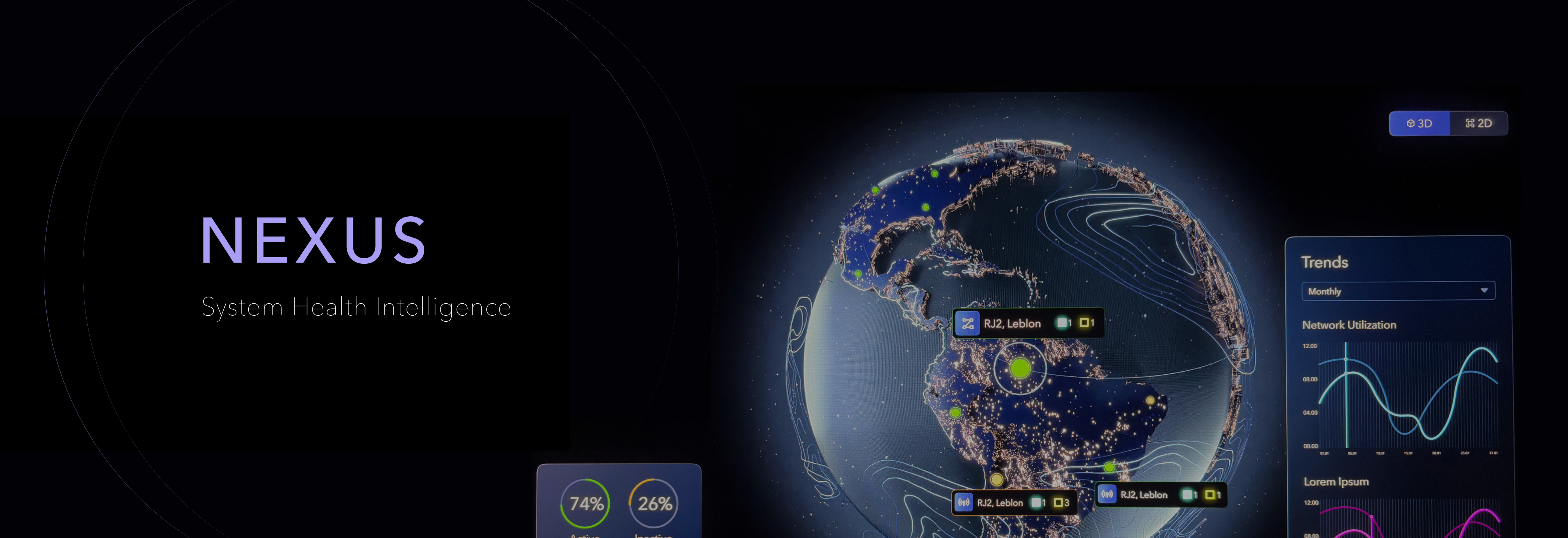
A centralized platform that gives enterprise teams a unified way to identify, track, and resolve data inconsistencies across all their dashboards — turning fragmented insight into one source of truth.

Timeline
2024
My Role
Product Designer
Team
8 Engineers
Status
NDA · Details Anonymized
Leveraged Skills
UX Research · Systems Design · Figma · Data Visualization
🔒 Some project details are protected under NDA. Content has been generalized accordingly.
The Problem

No one knew which dashboards to trust.

Enterprise teams were operating across dozens of disconnected dashboards — each with its own data sources, update cadences, and owners. When numbers didn't match across reports, there was no central place to investigate why. Teams were losing hours chasing data discrepancies manually.

Nexus was designed to give teams a single, intelligent platform to monitor dashboard health, surface inconsistencies early, and understand the full picture of their data environment at a glance.

Design Challenges

Complex data. Non-technical users. High stakes.

Making data health legible
Dashboard health metrics are inherently technical. The design needed to translate complex system states into information that non-technical stakeholders could act on immediately.
🔗
Unifying fragmented data sources
Dashboards pulled from multiple, inconsistent data pipelines. The UI needed to surface these connections clearly without overwhelming users with technical architecture.
🎯
Prioritizing what matters
With potentially hundreds of health signals, the interface needed smart prioritization — surfacing the issues that actually impact decisions, not every alert equally.
👥
Cross-team collaboration at scale
Issues span multiple teams and owners. The design needed to support assignment, escalation, and tracking without creating additional process overhead.
Design Principles

One source of truth, built for action.

01
Visibility before investigation
Users should understand the health of their entire dashboard ecosystem at a glance before drilling into specifics. The overview is never a gateway — it's the destination for most users.
02
Surface signals, not noise
Not every anomaly is an emergency. The platform intelligently prioritizes issues by impact, ensuring users focus on what affects decisions — not what's technically interesting.
03
Designed for trust
Every piece of data shown has a clear provenance. Users can always trace where a health signal came from, reducing the skepticism that often blocks action on analytics platforms.
Information Architecture

Structuring complexity into layers.

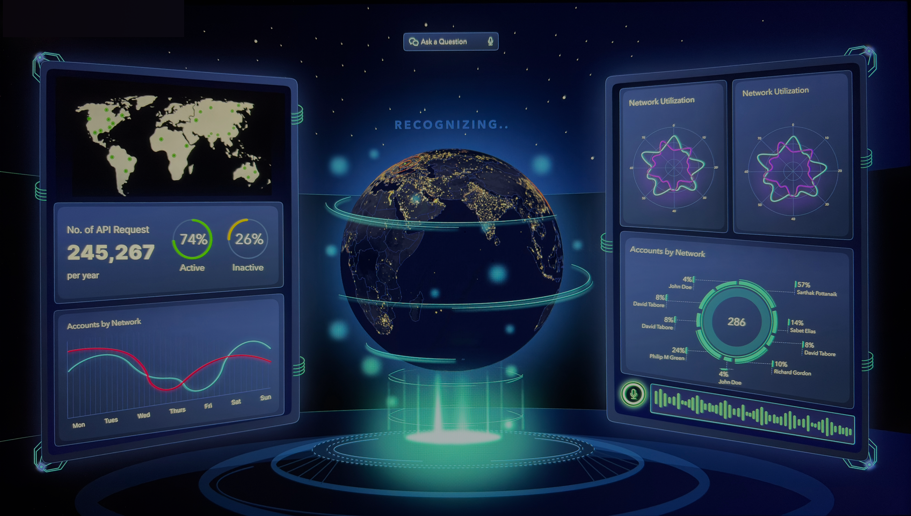
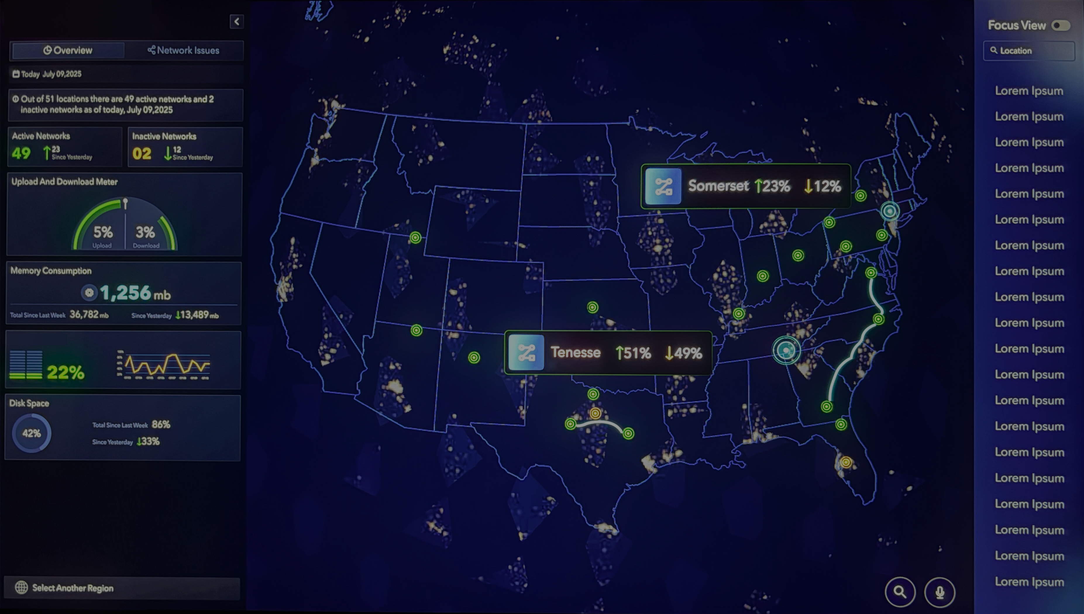
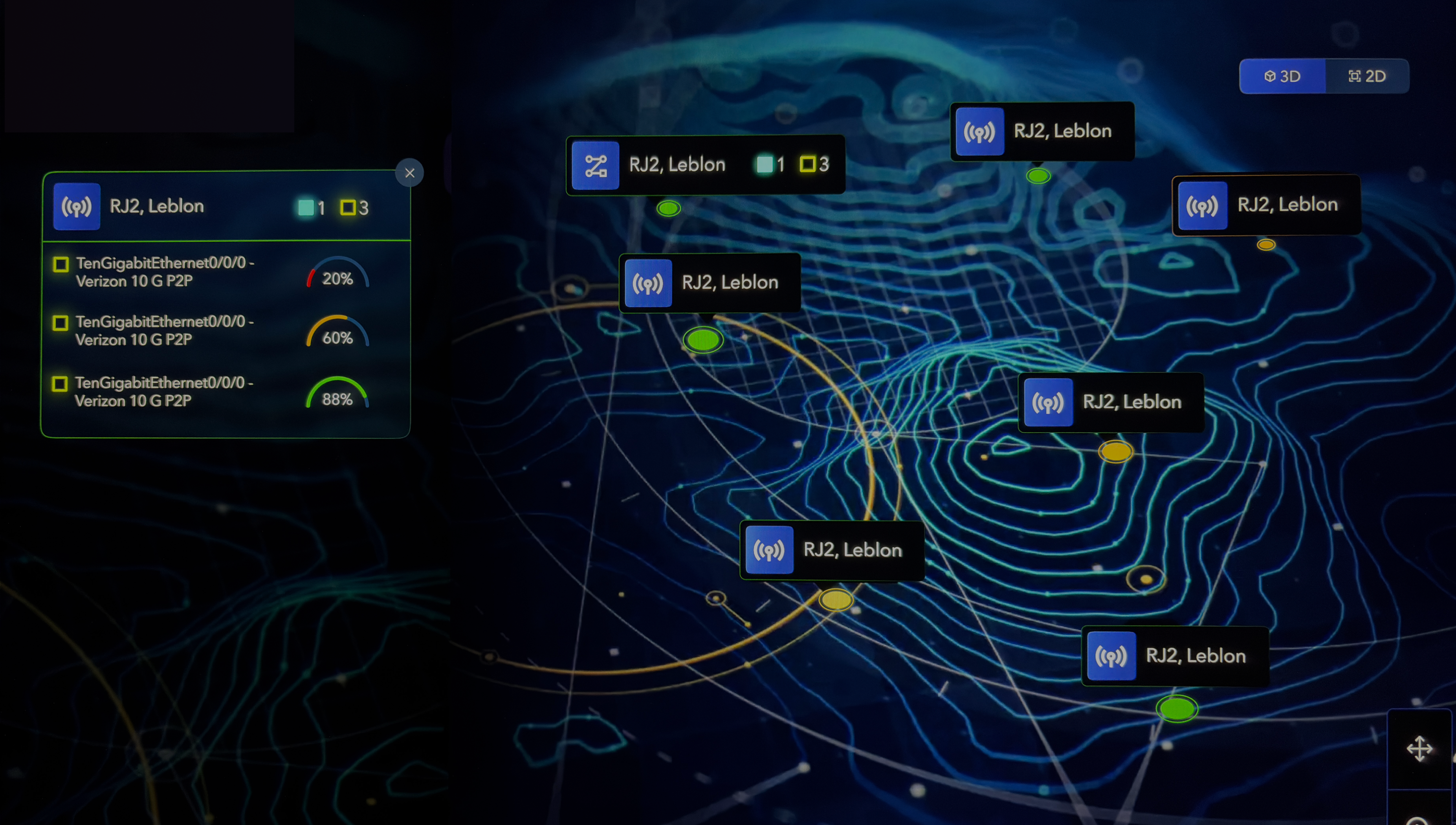
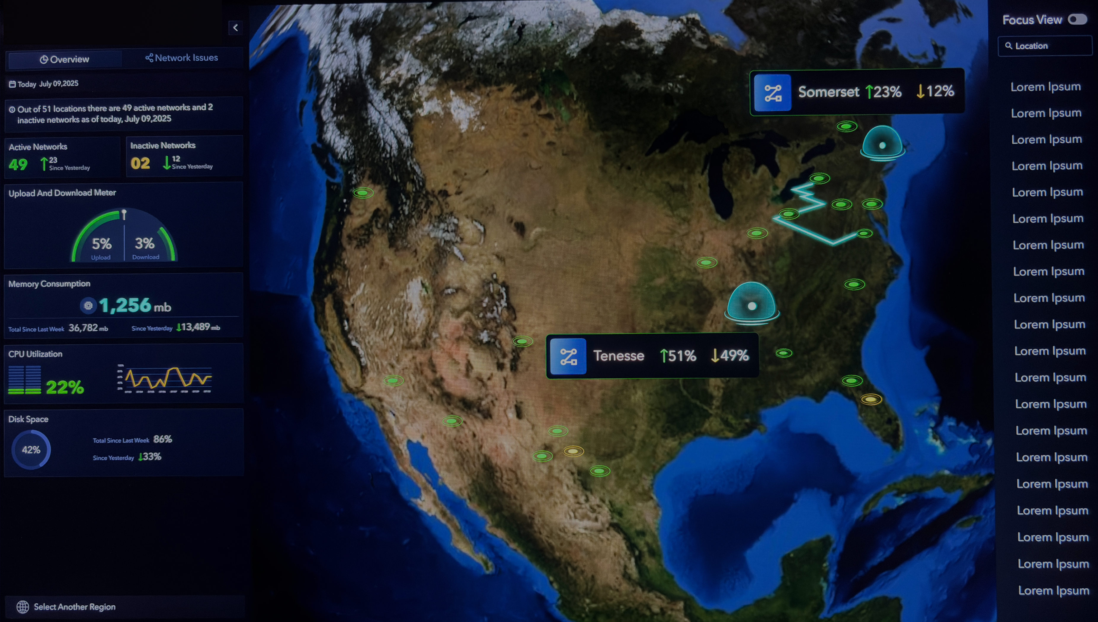
Nexus organizes monitoring data into structured layers — system health, incidents, service performance, infrastructure metrics, and alerts — allowing teams to quickly scan operational status while supporting deeper investigation when needed.

(Screens have been modified and data anonymized to protect confidential enterprise information)

Exploration 01
Flat hierarchy view
All dashboards surfaced at the same level — prioritized by health score and last-updated signal.
Exploration 02
Grouped by domain
Dashboards nested under business domains — Finance, Growth, Ops — for team-scoped visibility.
Exploration 03
Issue-first architecture
Entry point anchored to active incidents and flagged inconsistencies, with dashboards as secondary context.
Key Screens

From overview to resolution.

Outcome

One platform. Entire data ecosystem visible.

8
Engineers collaborated with, shipping end-to-end as sole designer
1
Unified platform replacing fragmented manual investigation workflows
Nexus unified the way enterprise teams identify and analyse their entire data ecosystem — replacing a fragmented, manual investigation process with a single platform. Specific metrics are protected under NDA.